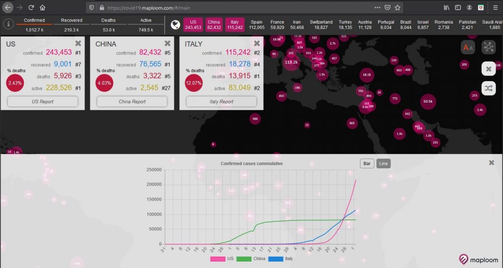
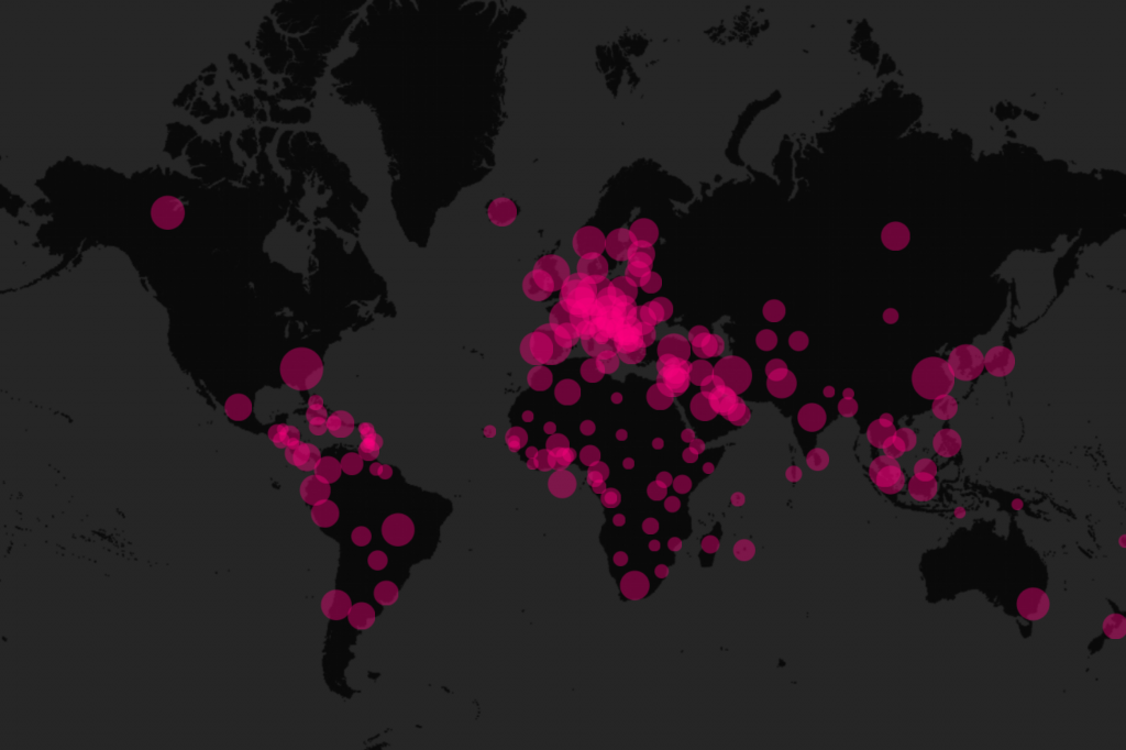
We have created an online interactive map to help visualise the COVID-19 pandemic. Using data collated and published by Johns Hopkins University we have created an interactive map and charts using our Maploom Platform. The site was built on a pro bono basis and is made freely available to all.
Visit covid19.maploom.com to get started. The map will be updated daily with the latest information and we will be adding further functionality in the coming days.